BLOOMINGDALE’S CHECKOUT
Opportunity
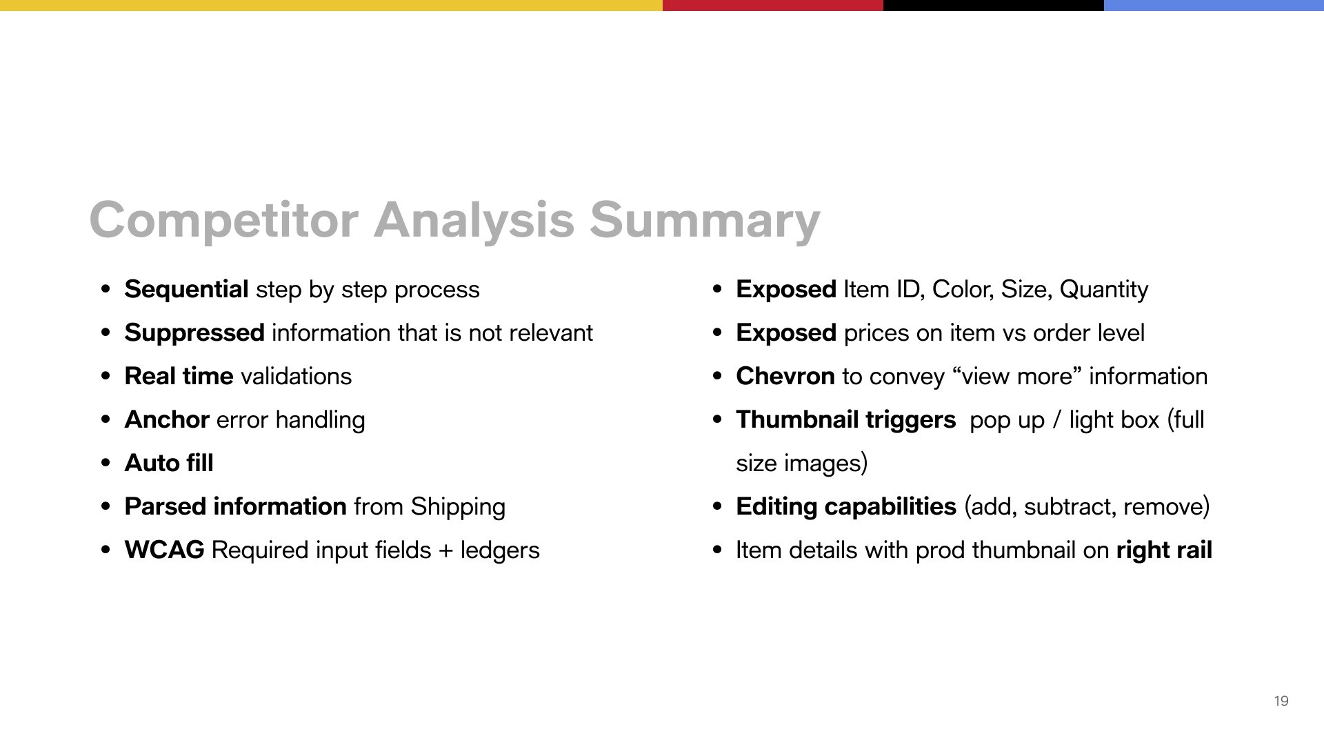
Make checkout feel faster and lighter by reducing the amount of information, tasks users face at once.
Design lens
Prioritize essential actions, progressively reveal detail, and create a calmer path from bag to order.
The problem
Internal UXR and Baymard research showed that presenting 10–15 form fields in one viewport made customers feel overwhelmed—especially on mobile. A long or complicated checkout is cited by 18% of users as a reason to abandon.
Success criteria
Track conversion, revenue per visitor, average order value, checkout-to-order rate, CSAT, and error and bounce rate to understand whether the streamlined flow performs better.
Hypothesis
Removing non-essential information and reducing visible tasks will lower cognitive load, helping customers complete purchase more quickly and confidently—and improving conversion.
Scope
A dual-brand checkout experience for Macy’s and Bloomingdale’s across web and app—covering signed-in, new, and guest customers; BOSS/BOPIS, mixed-bag, and big-ticket scenarios.